
The front cover.

The inner cover.

The second inner cover.
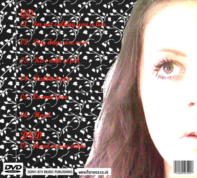
The back cover.
 This is the album cover for Florence and the Machine's debut "Lungs".


The life size letters are a number of different colours which are jumbled together which presents a rainbow effect. This makes the audience think that the songs presented within the album are fun and exciting, with a number of different moods. The image is situated directly in the centre of the cover. Which shows that it is the dominant part of the cover. Lily Allen has been placed quite high up, presenting herself in a flourishing pose which too shows her personality.
The artists name is presented in the top left hand corner of the cover, in an easy to read, basic font. "The Fear" has been presented in lower case letters in italics which show it is not a specifically dominant part of the cover but the information it provides is important to the audience.
The background of the cover is just plain white, which helps both the image and the titles to stand out. Shadowing is used on the over sized lettering which shows them to be 3D and as though they are standing out form the cover themselves.

